Viewer (beta)#
The modality XPLR Viewer (“the Viewer”) is a browser-based application that provides interactive visualisations of methylation analysis. It reads analysis result files that are generated by modality XPLR software and allows you to browse, explore and visualise those results.
The functionality of the Viewer is designed as an alternative to the static HTML reports generated by the modality XPLR CLI, and make it easier to organise and visualise groups of related files. The Viewer has been optimised to work with the outputs of the modality XPLR Core Workflow, but can also work with the outputs for individual modality XPLR commands.
Local hosting
Although the Viewer uses a web browser to provide an interactive experience, all files are hosted and served locally. Using the Viewer does not cause any data to leave your network.
Beta status
The modality XPLR Viewer feature is in beta status. Features are under development and may be subject to change. We welcome your feedback and suggestions via this form or by e-mailing support@biomodal.com.
Video: modality XPLR Viewer overview#
This video provides an overview of the Viewer features and visualisations, using outputs generated by the Core Workflow. See Video: Running the modality XPLR Core Workflow to learn how the data were generated.
Installation and launch#
Installation#
The Viewer is bundled with modality XPLR v1.1.0 and later. There are no additional installation steps required to access the Viewer. For detailed installation instructions, see Video: Install modality XPLR.
Preparing input files#
To launch the Viewer, you need to supply a directory containing the output of modality XPLR commands like modality biological-qc, modality get and modality dmr call.
The Viewer will automatically search the directory and sub-directories for relevant files.
The easiest way to generate an initial set of results is with the modality XPLR Core Workflow.
The Core Workflow script uses a metadata file and one or more Zarr stores to generate a range of useful analysis that the Viewer can help you to explore and interpret.
For the best experience, we recommend using core-workflow-v2.0.sh or higher.
Note
modality viewer -r or --root-dir should be pointed to the directory containing the modality output files. To ensure that the sample sheets and Zarr stores can be accessed in report pages such as the Extract, BioQC and Tracks, these files must reside within the directory specified by --root-dir.
Launching the Viewer#
The Viewer is launched from the command line using the modality viewer command.
This will initiate a Viewer session in the current terminal window.
If you need to run other modality commands simultaneously, open a new terminal window.
The only required argument is the path to a directory containing output files from modality XPLR, the root directory.
The Viewer will automatically discover analysis files within the root directory, irrespective of subdirectory hierarchy.
If the root directory contains a large set of input files, it may take longer for the Viewer to launch.
Tip
When running modality analysis commands, set the output directory to a dedicated project or study-focused directory. You can then use a single project or study-focused directory as the root directory for the Viewer. Ensure that Zarr stores and sample sheets are included within this directory, see the note above for details.
This will make it easier to launch the Viewer with the relevant files. Avoid moving and renaming modality result files after they have been generated, as this will invalidate the provenance information that the Viewer uses to track file origins.
The modality viewer command has the following options:
Option |
Type |
Required |
Description |
|---|---|---|---|
|
TEXT |
Yes |
The path to the root directory containing modality XPLR output files. The Viewer will search this directory and all subdirectories for relevant files. |
|
INTEGER |
No (default: 5050) |
The port for the Viewer to communicate with modality on. |
|
TEXT |
No (default: localhost) |
The host to bind the server to. |
|
FLAG |
No (default: False) |
If set, the Viewer will run on developer i.e. debug mode and will disable functionalities requiring communication with modality. |
|
FLAG |
No (default: False) |
Run only the Flask API, without the browser interface. |
|
FLAG |
No (default: False) |
Show this help message and exit. |
Usage example#
modality viewer -r /path/to/output/files
This command launches the modality XPLR Viewer and reports the URL:
==================================================
�🚀 Modality XPLR Viewer is running!
📱 Open in browser: http://localhost:5050
Press Ctrl+C to stop
==================================================
As suggested, open the reported URL in your web browser to access the Viewer.
Note
The Viewer is primarily tested and supported on Google Chrome. Basic compatibility has been verified on Safari, Firefox, and Edge.
File navigation#
File discovery#
The Viewer initially loads on the Analysis Files page. From here, you can access links to the user documentation, or to leave feedback whilst the feature is in beta status.
When the Viewer is started, it will search the root directory supplied to Viewer with --root-dir and automatically discover compatible files, dividing them into different types of analysis based on the modality XPLR command that generated them.
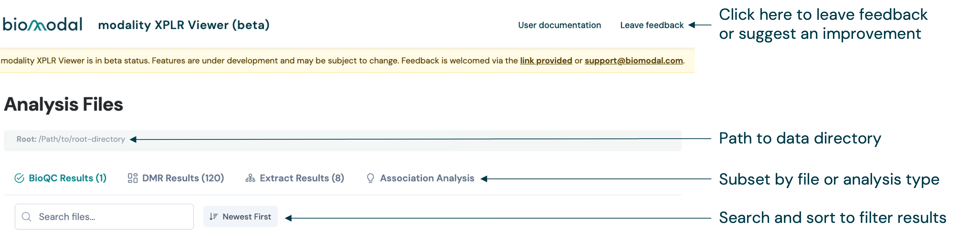
The different types of analysis are represented as tabs in the navigation bar at the top of the page. The number in parentheses shows how many files were detected. The types of analysis currently supported are listed below:
Analysis group |
Description |
|---|---|
BioQC Results |
|
DMR Results |
For comparison of matched |
Extract Results |
For comparison of matched |
Within an analysis group, files (or groups of related files for comparison) are represented as cards. Each card has a title based on the analysis feature and type. The original command input parameters, options and arguments are also displayed.
For analyses with a single result file, e.g. Biological QC, the card includes a copy-ready path to the source file.
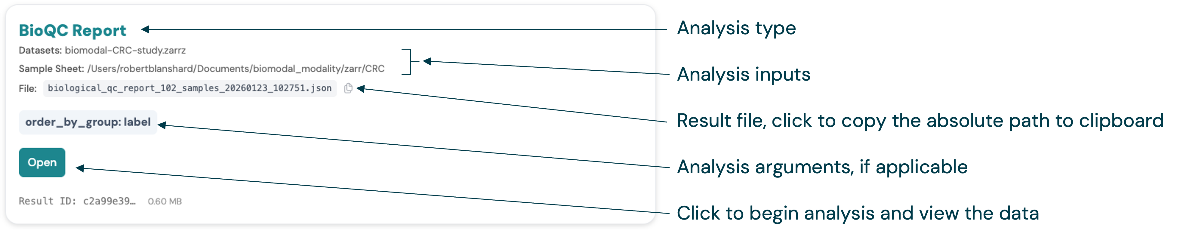
Simply click on the card’s action button e.g. “Open”, to view a report for the analysis.
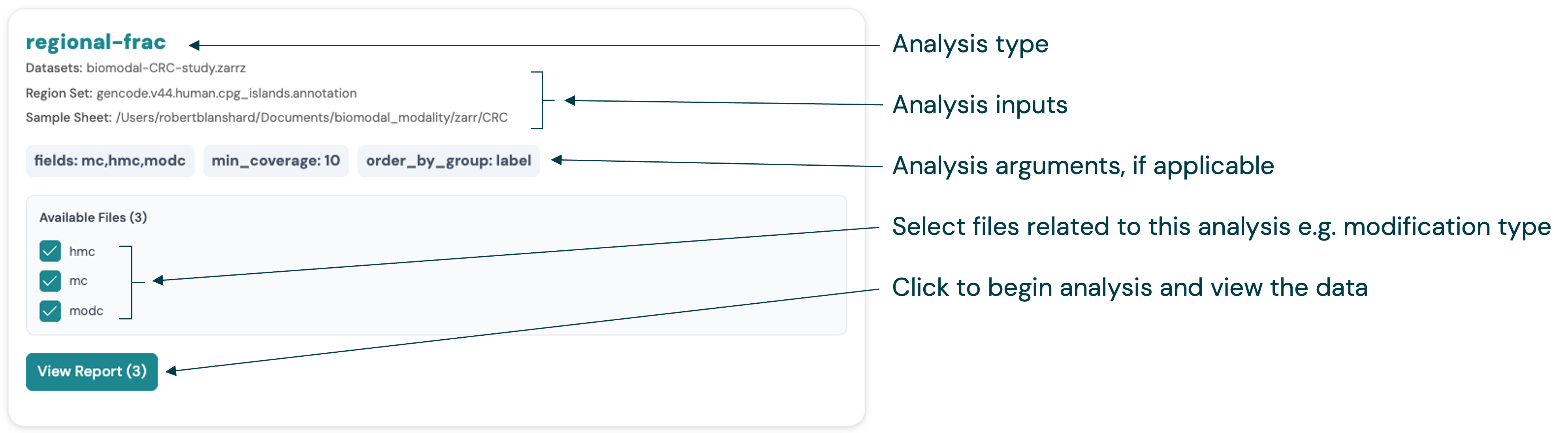
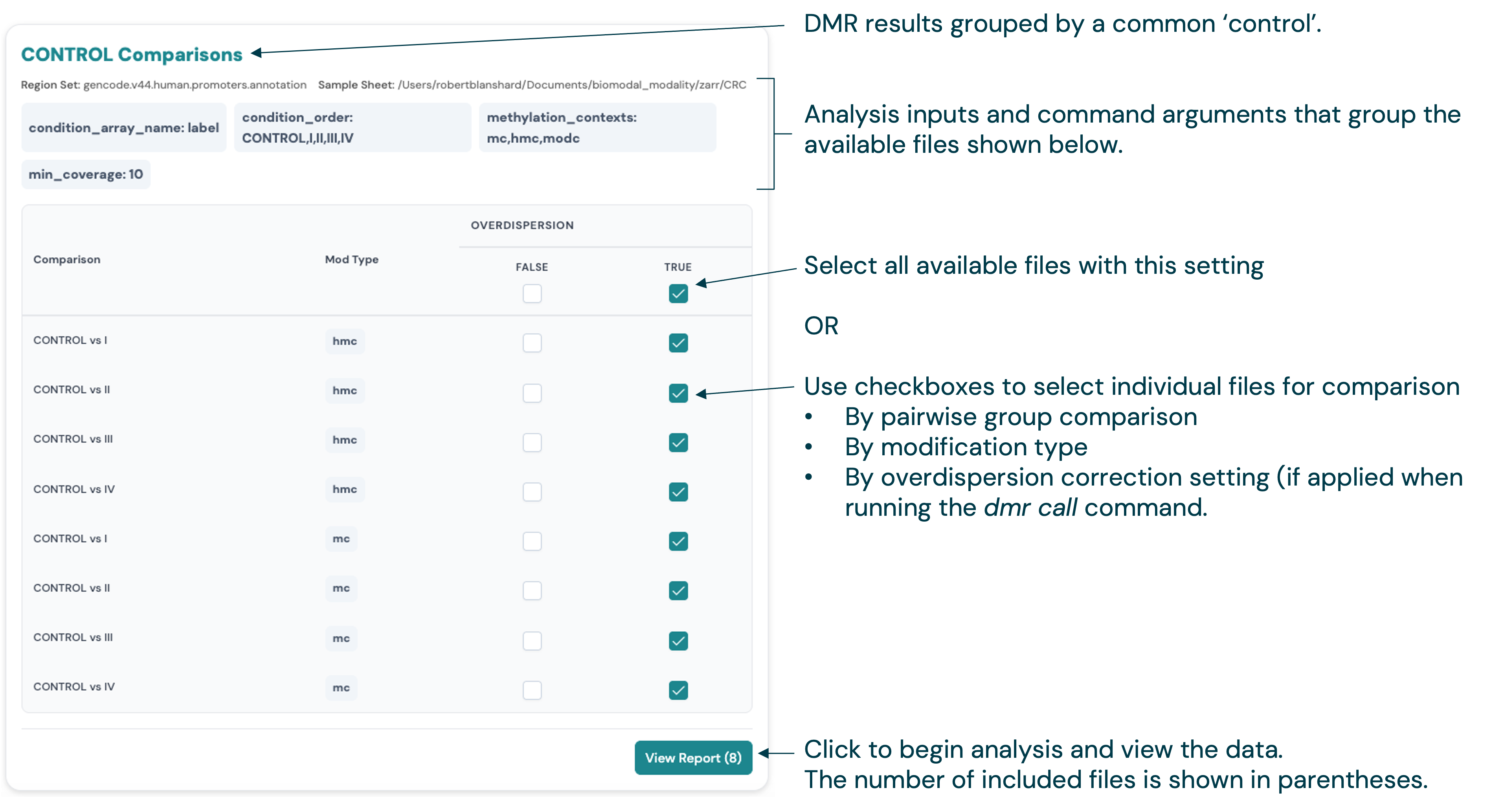
For analyses with multiple related files, e.g. DMR Results, the card lists files that are matched by the analysis parameters used on the original CLI command. Use the checkboxes to select the files to view, then click the “View Report” button.
Filters#
To the left of the analysis group page is a set of filters for file discovery. The filter options will depend on the type of analysis, but will typically include categorical fields based on the original command input parameters, options and arguments.
Here is the file filter panel for the DMR Results page, which allows you to quickly filter to specific subsets of the DMR results based on e.g. the DNA modification types and group comparisons:

Further filtering is available at the card level. For example, for DMR results, use the checkboxes to select specific files for group comparisons, modification types and overdispersion correction settings. Click the “View Report” button to load the DMR comparison report.
Viewer report pages#
Common analysis elements#
Across the different report pages, the Viewer uses common elements to display results, support filtering and interactivity, and export functions. These include:
Configuration review#
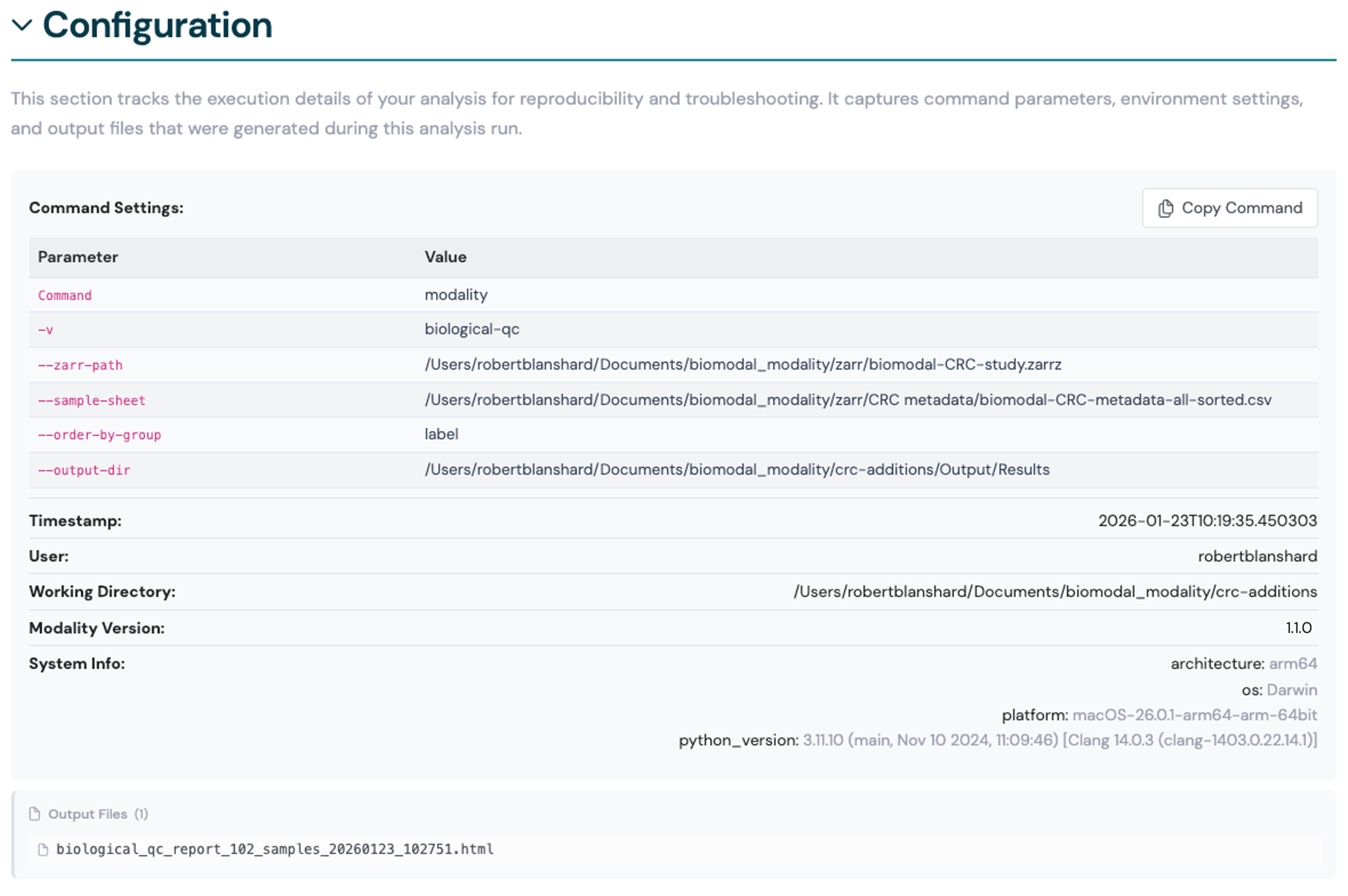
A collapsible summary of the original command input parameters, options and arguments that generated the report files.
Click Copy Command to copy the original command to your clipboard, which you can then paste into a terminal to reproduce the analysis with the same parameters.
Here we show an example of the configuration summary for a Biological QC report.
Data tables#
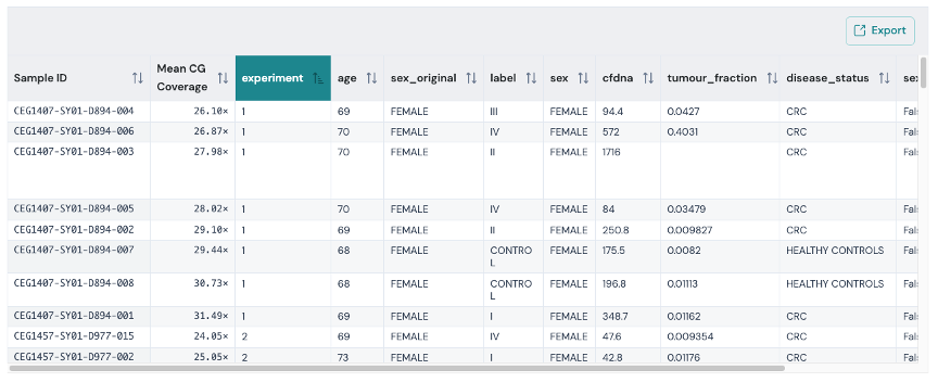
Where applicable, the Viewer displays interactive tables showing the underlying source data for the report.
The tables support filtering, sorting and searching to help you explore the data.
To export the table data with the currently applied filters, click the Export button to download a new copy.
In this example, the table shows the sample sheet metadata used for a Biological QC analysis. The Biological QC command generates coverage statistics at methylation contexts, which are included in the results table.
Therefore, exporting this file will include the additional coverage data, which may be useful for filtering samples before running other modality commands.
Applying metadata labels#
Where applicable, the Viewer allows adding sample labels from the metadata to make the plots more interpretable. This can be useful in unsupervised classifications, e.g PCA plots and clustered heatmaps, to evaluate covariate, batch effects, and help you understand the importance of different multiomic features.
The feature is enabled by providing sample sheet metadata files to the Viewer’s --root / -r directory flag.
The Viewer will automatically discover these files and make the metadata fields available as options for sample labels in the report pages.
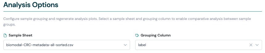
For example, on the Extract Results page, you can use metadata to apply the --order-by-group function to violin plots and Pearson correlation plots without needing to re-run the CLI command.
Select a metadata sample sheet file, then select the metadata field to use for sample labels in the plots.
Biological QC report#
The Biological QC page allows you to view the reports generated by the modality biological-qc command and represents the same content. The report contains
quality control visualisations of your methylation dataset, including CpG coverage depths, sample correlation heatmaps, and principal component analysis (PCA)
to identify patterns, outliers, and batch effects.
For information on generating data, see the Biological QC section.
Configuration#
A collapsible summary of the original command input parameters, options and arguments that generated the results. See Configuration review for more information.
Analysis options#
This section of the report allows you to configure the visualisation of the results using metadata labels. See Applying metadata labels for more information.
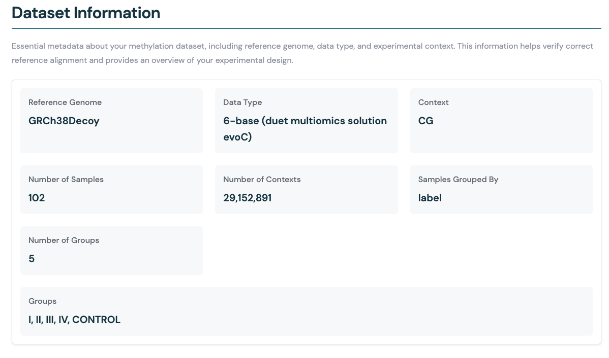
Dataset information#
The Dataset information section provides a summary of the Zarr store used for the analysis. This includes key details about the input data as well as the analysis carried out.
Reference Genome: The genome assembly used for alignment (e.g., GRCh38Decoy).
Data Type: The sequencing or assay type (e.g., duet evoC).
Context: The methylation context analysed (e.g., CG).
Number of Samples: Total number of samples included in the Zarr store.
Number of Contexts: The number of unique genomic contexts (e.g., CpG sites for CG context) analysed in the samples.
If the data is aggregated by some metadata field using --aggregate-by-group (e.g., by label), the following additional information is provided:
Samples Grouped By: The metadata field used to group samples (e.g., label).
Number of Groups: The number of distinct groups identified in the grouping field.
Groups: The names of the groups present in the dataset (e.g., I, II, III, IV, CONTROL).
Sample information#
An interactive table showing the sample sheet metadata used for the analysis. The Biological QC command generates genome-wide coverage statistics at methylation contexts, which are also included in the table. Therefore, exporting this file will include the additional coverage data, which may be useful for filtering samples before running other modality commands.
Pearson correlation heatmap (genome-wide methylation levels)#
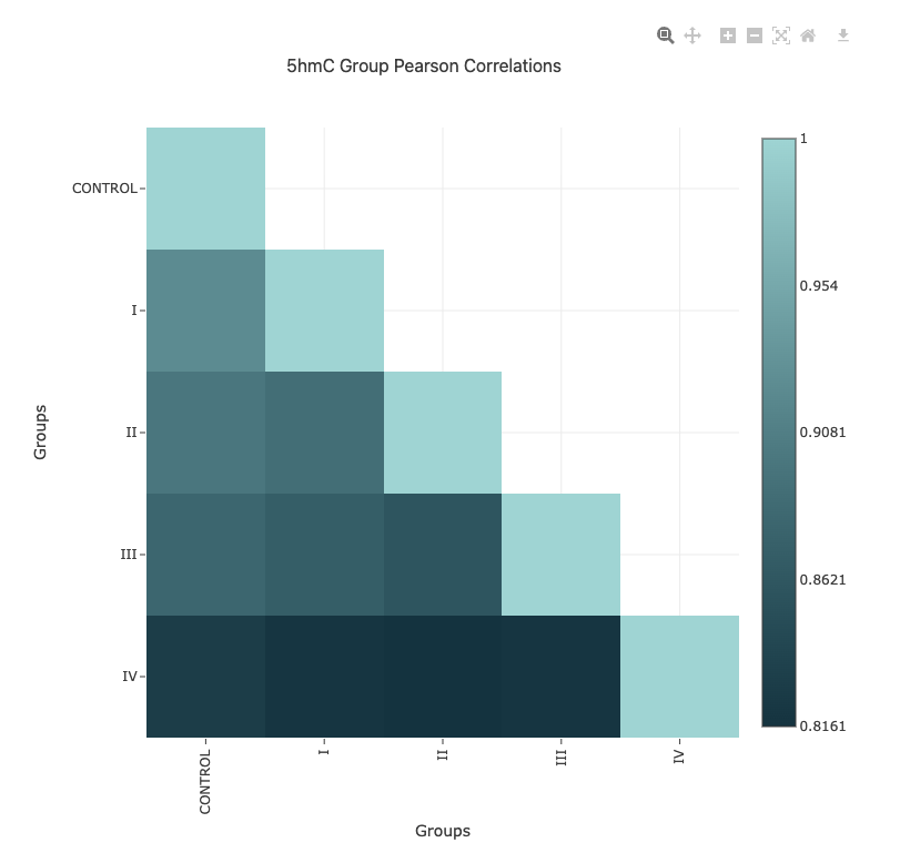
The Pearson correlation heatmap provides a visual summary of the similarity between all samples in your dataset, based on genome-wide methylation levels. Each cell in the heatmap represents the Pearson correlation coefficient between a pair of samples, with higher values indicating greater similarity in methylation patterns.
Modification types: Separate heatmaps are shown for each methylation context (e.g.,
5mC,5hmC,5modC) in the same report page, allowing you to compare patterns across different modification types.Interpretation: Clusters of high correlation may indicate technical replicates, biological similarity, or batch effects. Outliers or low-correlation samples may suggest data quality issues or unexpected biological variation.
Interactivity: You can hover over cells to view the exact correlation value for any sample pair.
Use the correlation heatmap to assess overall data quality, identify potential outliers, and explore relationships between samples before proceeding with downstream analyses.
Principal component analysis (PCA)#
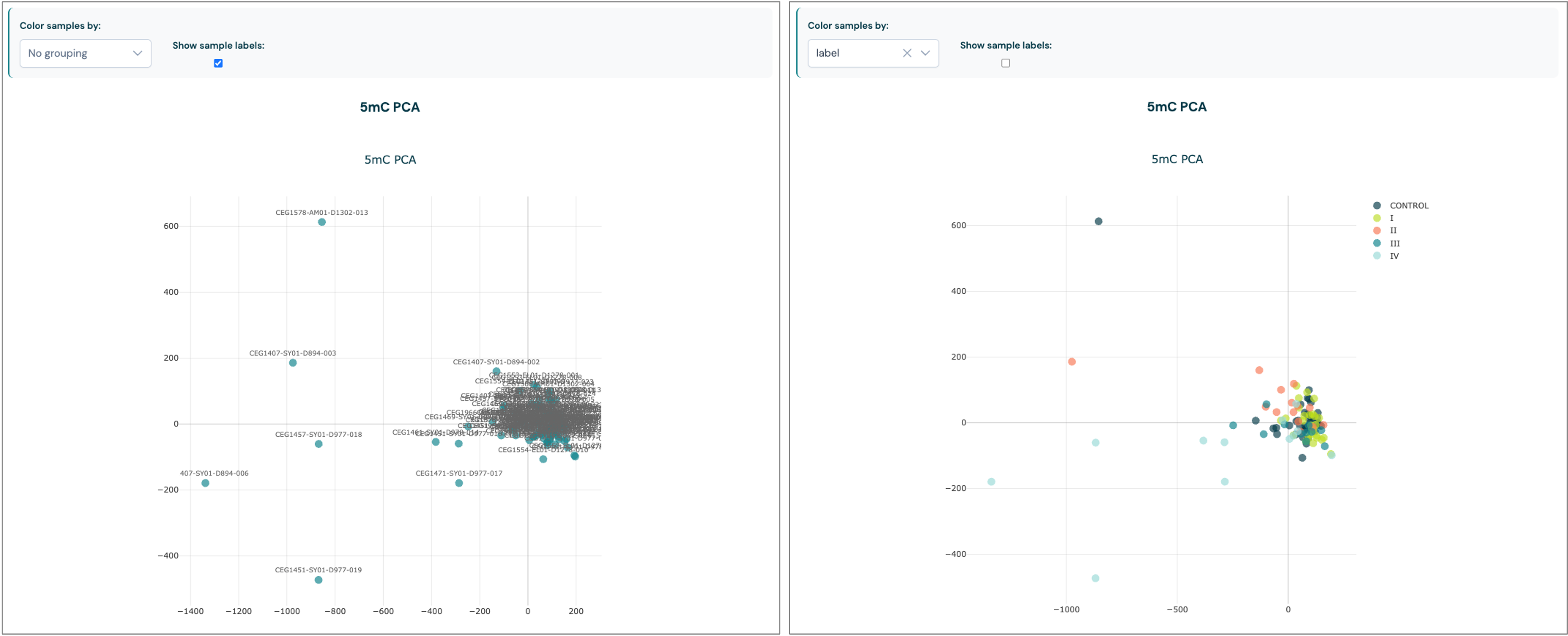
The Principal Component Analysis plots provide a visual summary of the main sources of variation in your methylation dataset. PCA reduces the complexity of genome-wide methylation data by projecting each sample onto a set of principal components, which capture the largest sources of variance.
Modification types: Separate PCA plots are generated for each methylation context (e.g.,
5mC,5hmC,5modC), allowing you to explore patterns specific to each modification.Sample grouping and colouring: Samples can be coloured and grouped by available metadata fields (such as experimental group, batch, or tissue type), making it easier to identify clusters, trends, or batch effects.
Interpretation: Clusters of samples may indicate biological similarity or technical replicates, while outliers may highlight potential data quality issues or unique biological features.
Interactivity: If a
--samplesheetwas provided when callingmodality biological-qc, you can select different metadata fields present in your sample sheet for colouring to explore relationships in your data. Sample labels can also be toggled on or off with a checkbox.
Use the PCA plots to assess sample clustering, detect outliers, and gain insights into the factors driving variation in your dataset before proceeding with further analysis.
Feature extraction report#
Use the Extract Results tab to view summaries of statistics generated by the modality get mean and modality get regional-frac commands.
The report page contains comprehensive visualisation of feature extraction results from your methylation dataset. You can plot the distribution and correlation
patterns of extracted features across genomic regions by either setting a --window-size or passing a --bedfile to the modality get CLI command.
The plots provide an overview of how methylation levels across genomic regions or features, vary between samples.
For information on generating data, see the Extracting methylation statistics section.
Configuration#
A collapsible summary of the original command input parameters, options and arguments that generated the results. See Configuration review for more information.
Analysis options#
This section of the report allows you to configure the visualisation of the results using metadata labels. See Applying metadata labels for more information.
Methylation distribution (violin plots)#
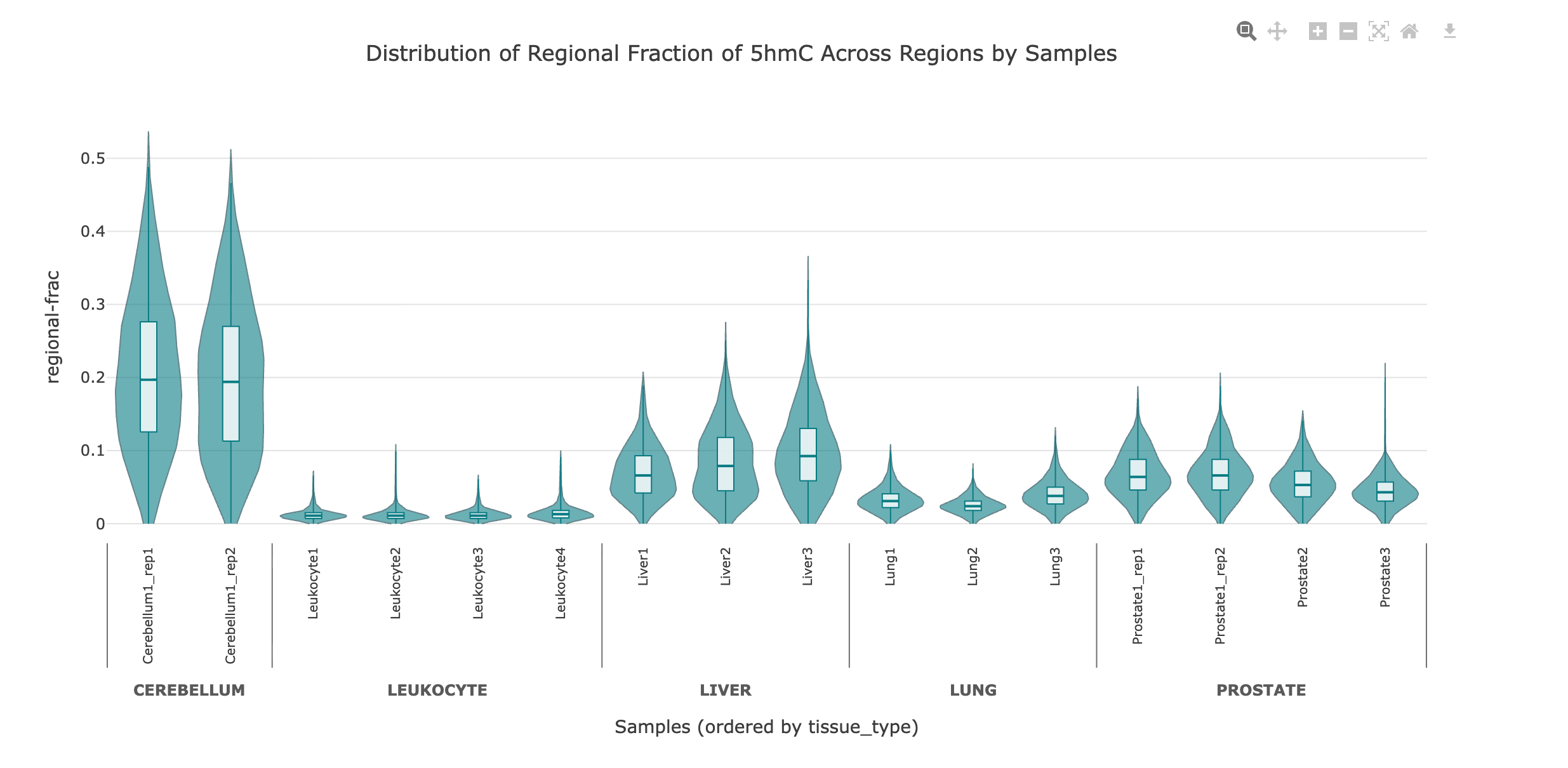
The violin plots display the distribution of methylation values (e.g., regional fractions or means) across all samples/groups for selected genomic regions. Each violin represents a sample with both the range and density of methylation values.
Interpretation: The shape and width of each violin indicate the spread and frequency of methylation values.
Grouping: If the data is generated with the flag
--aggregated-by-group, samples are grouped by the selected metadata field e.g., label, disease state etc., allowing you to compare distributions across experimental groups.Interactivity: Hover over violins to see summary statistics such as
mean,median,min,maxand alsoQ1andQ3quartiles for each group.
Use violin plots to visually compare methylation distributions between samples/groups, identify outliers, and assess variability within and between sample categories at the feature or region level.
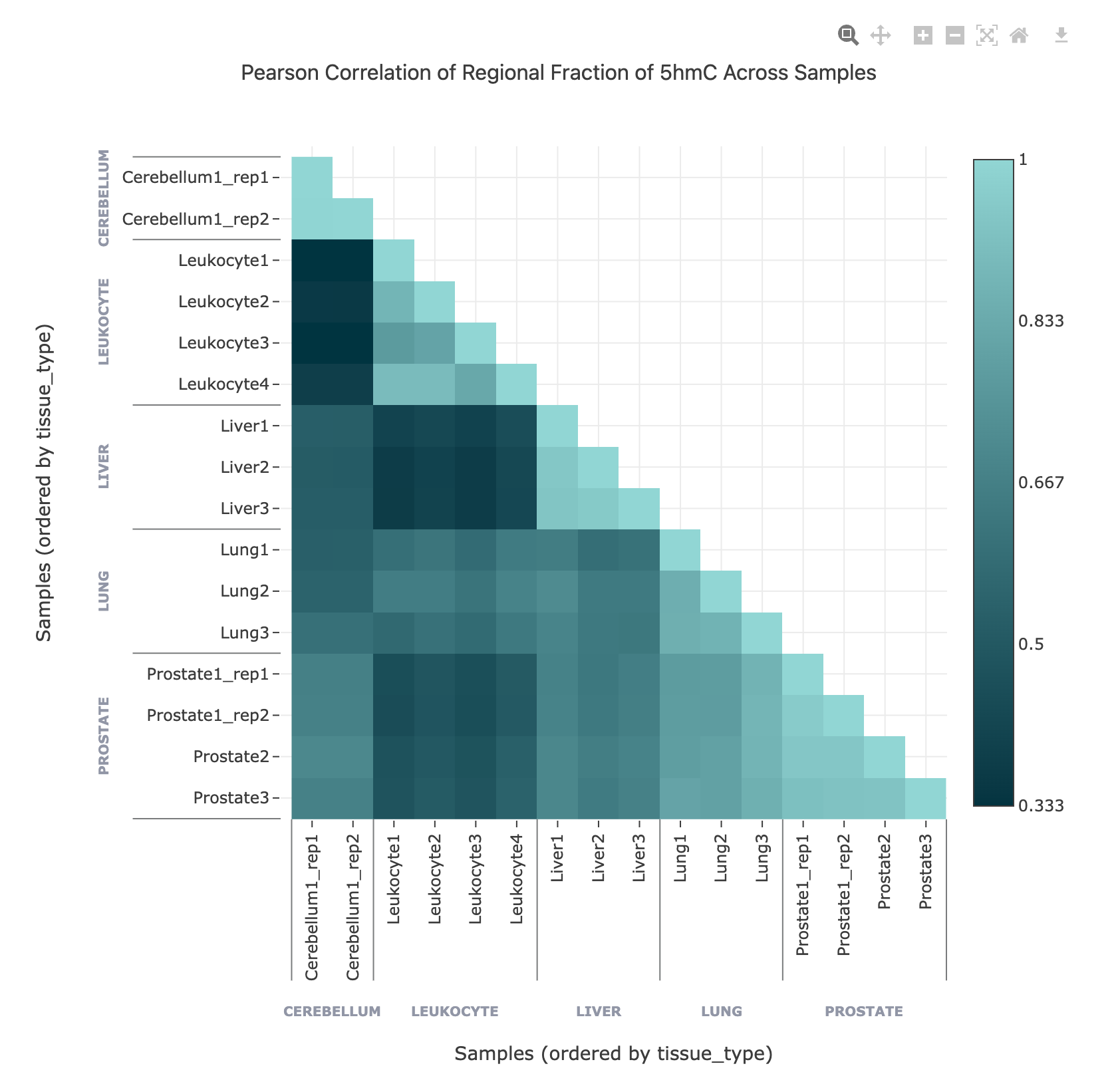
In this example, the regional fraction of 5hmC over gene bodies is shown as a violin plot, with samples ordered by tissue type metadata.
Pearson correlation heatmap (over regions)#
The Pearson correlation heatmap shows the similarity between samples/groups based on methylation values across selected genomic regions. Each cell in the heatmap represents the Pearson correlation coefficient between a pair of samples/groups, with higher values indicating more similar methylation profiles.
Interpretation: High-correlation clusters may indicate biological similarity or technical replicates, while low-correlation samples may be outliers or affected by technical issues.
Grouping: If the data is generated with the flag
--aggregated-by-group, samples are grouped by the selected metadata field.Interactivity: Hover over cells to view the exact correlation value for any sample pair.
Use the correlation heatmap to assess relationships between samples/groups, detect outliers, and explore the structure of your dataset at the feature or region level.
In this example, the regional fraction of 5hmC over gene bodies is shown in a Pearson correlation matrix, with samples ordered by tissue type metadata.
DMR comparison report#
The DMR comparison page moves beyond the HTML reports produced by the CLI, to provide a more interactive experience for exploring and interpreting DMR results from multiple group comparisons.
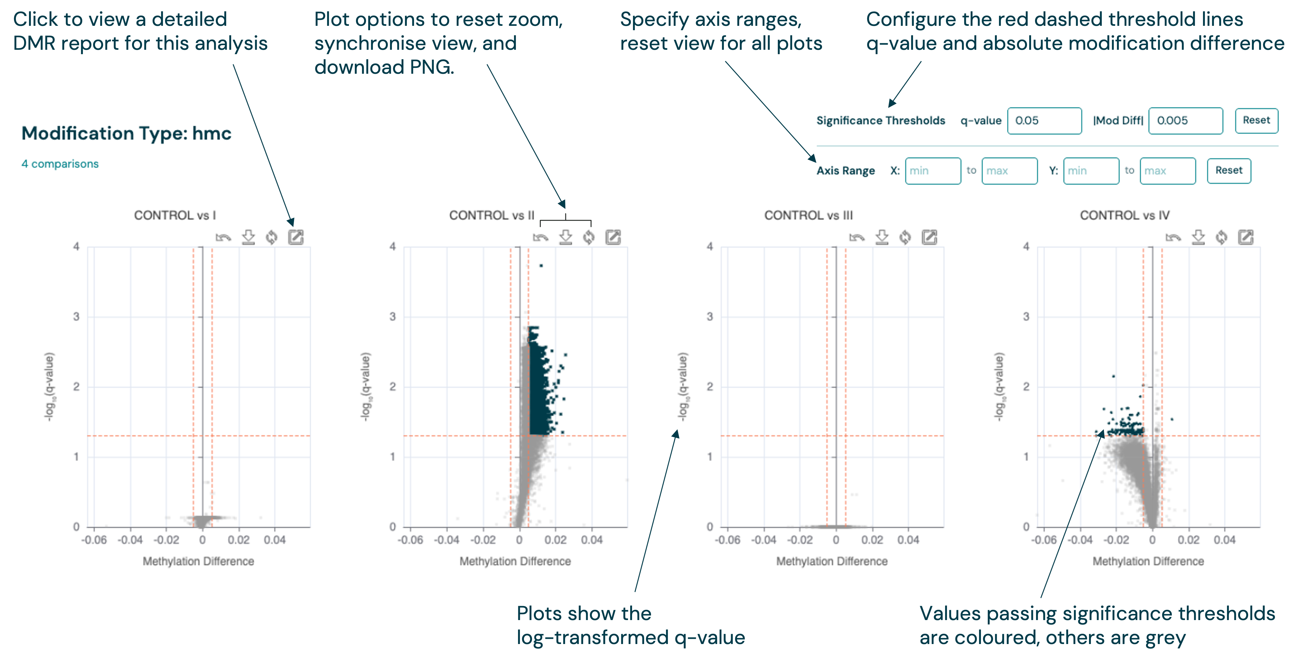
Volcano plots are shown as a series for each modification type, with multiple controls to filter the DMRs by significance and configure the plot appearance. Applying filters will dynamically update the plots and data tables, to help you find the most important regions for your analysis.
The detailed DMR report for each DMR group comparison can be accessed by clicking the View Full Report button (
 ) on a specific volcano plot.
Downloading plot images#
The DMR comparison page includes a Download images button that exports the volcano plots as PNG files.
Clicking it opens a dialog listing each context row (e.g. 5mC, 5hmC). Each row is exported as a separate composite PNG image, stitched together from the volcano plots in that row.
A progress indicator shows a spinner while each image is being generated, which changes to a check mark when complete.
Files are saved to your browser’s default downloads folder with a timestamped filename, e.g. dmr-comparison-5mC-20260326-1430.png.
DMR comparison table (multi-file)#
On the DMR comparison page, each methylation context section (e.g. 5mC, 5hmC) includes its own comparison table below the volcano plots. The comparison table brings together key columns from each loaded file and displays them side-by-side. Column headers are grouped in two tiers: the top tier shows the file (group comparison) and the second tier shows the individual metrics (q-value, modification difference, etc.).
The leftmost columns are fixed and shared across all files: Chr, Start, End, and — when present in the source BED files — Name and Annotation.
These columns identify each region and its genomic annotation, making it easy to interpret results without cross-referencing the original files.
Where a region overlaps multiple annotations, values are shown as semicolon-delimited (e.g. promoter;exon;gene).
Synchronised filtering between plots and multi-file table#
The threshold controls above each volcano plot group (q-value and modification difference) are shared with the comparison table for that context. When you adjust a threshold, the same filter is applied to both the volcano plot and the table: volcano plot datapoints are segmented into significant and non-significant groups, and the table shows only the rows that meet the criteria. Cells that pass the thresholds are highlighted.
Table features#
The comparison table supports column sorting and pagination for large result sets.
Above the table, two action buttons let you get data out of the Viewer:
Copy — copies the coordinate and annotation columns (Chr, Start, End, Name, Annotation) for the rows currently visible on the table-page to your clipboard as tab-separated text. Only the current table-page is copied, not the full filtered dataset. The button label briefly changes to Copied! to confirm the action.
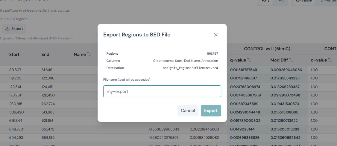
Export — opens a dialog to write the full set of currently filtered rows to a BED file in a directory of your choice. You specify the filename;
.bedis appended automatically. The dialog shows the region count and column list that will be exported before you confirm. Unlike Copy, Export includes all filtered rows regardless of pagination.
See Data tables for more information on common table features.
Per-context comparison tables#
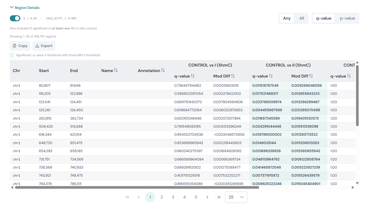
Each methylation context section of the DMR comparison page contains a collapsible Region Details area. Click the Region Details header to expand or collapse the table.
Above the table you will see filter controls for that context:
A p-value / q-value toggle that switches the significance metric used across the entire context section. When set to q-value (the default), the volcano plot Y-axis shows
-log10(q)and the table metric column is labelled q-value. Switching to p-value changes both to use the raw p-value instead.A filter toggle next to the threshold readout (e.g.
q ≤ 0.05 · |mod_diff| ≥ 0.005). When the toggle is on, only rows meeting both thresholds are shown. Turning it off disables filtering and shows all region rows regardless of significance.A row count showing how many regions are currently passing the filter and will be included in any export.
An Any / All selector that controls how rows are included when multiple files are loaded:
Any — include a row if it is significant in at least one file.
All — include a row only if it is significant in every file.
Cells that meet the significance thresholds are highlighted with a teal background; a legend above the table explains the convention.
The table reloads automatically whenever you adjust the thresholds on the volcano plot controls, change the filter mode, or toggle the filter.
Detailed DMR report#
The detailed DMR report is accessed by clicking the View Full Report button (
) in the top-right corner of the corresponding volcano plot on the DMR comparison report page.
The detailed DMR report shows the analysis outputs of a DMR analysis between two groups of samples, using result data that was generated by the modality dmr call command.
In the Viewer, this report builds upon the static HTML report that is generated by the CLI modality dmr plot command, and provides a more interactive experience to explore the DMR results.
It is not necessary to run modality dmr plot to view the DMR results in the Viewer, as the Viewer will automatically read the relevant files and generate the visualisations.
For more information on DMR calling, see the Calling differentially methylated regions (DMRs) section.
Configuration#
A collapsible summary of the original command input parameters, options and arguments that generated the results. See Configuration review for more information.
DMR summary#
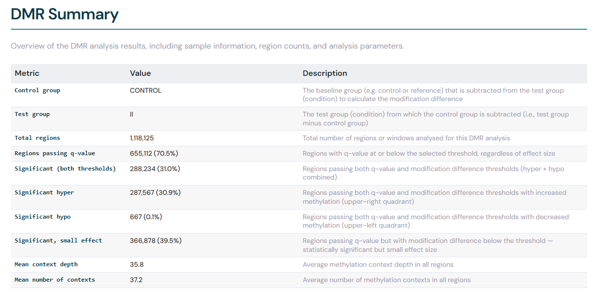
The DMR Summary section contains an overview of the DMR analysis results, including sample information, region counts, and analysis parameters. The summary table includes dynamic significance counts that automatically update when you adjust the q-value and modification difference thresholds in the volcano plot controls above.
The significance counts break down as follows:
Regions passing q-value — the number of regions where the q-value is at or below your chosen significance threshold.
Significant (both thresholds) — regions passing both the q-value threshold and the absolute modification difference threshold.
Significant hyper — significant regions where the modification level is higher in the test group (positive modification difference).
Significant hypo — significant regions where the modification level is lower in the test group (negative modification difference).
Significant, small effect — regions where the q-value passes the significance threshold, but the absolute modification difference is below the effect size threshold. These are statistically significant but may not be biologically meaningful.
Each count is accompanied by a percentage of the total region count. Adjusting either threshold causes these counts to recalculate in real time.
DMR volcano plot#
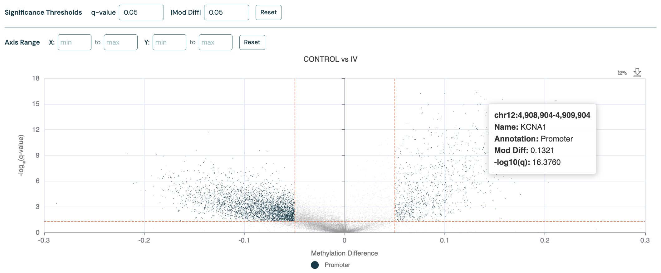
The DMR volcano plot visualises the relationship between methylation differences (x-axis) and statistical significance (y-axis),
allowing you to identify regions with both biologically meaningful and statistically significant changes.
Orange dashed lines indicate the thresholds for significance and methylation difference, which can be adjusted with the controls above the plot.
Datapoints are shaded according to the filter status.
The region Annotation field from the input --bedfile is used to label the datapoints and will be shown in the legend, e.g “Promoter”.
Hover your cursor over a point to view additional information, or click any point to copy its genomic coordinates to your clipboard and access Genome track plots for that region.
See Region highlighting for instructions on how to search and filter to specific genes or regions on the volcano plot.
Below is a volcano plot for 5mC DMRs (CRC Healthy Control vs Stage IV) over promoter regions, with overdispersion correction turned on.
p-value distribution histogram#
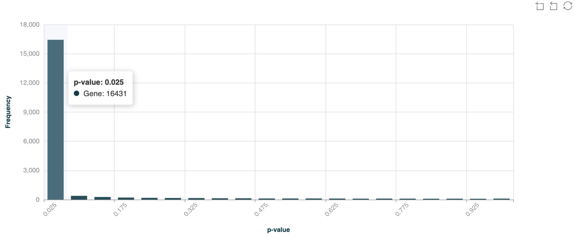
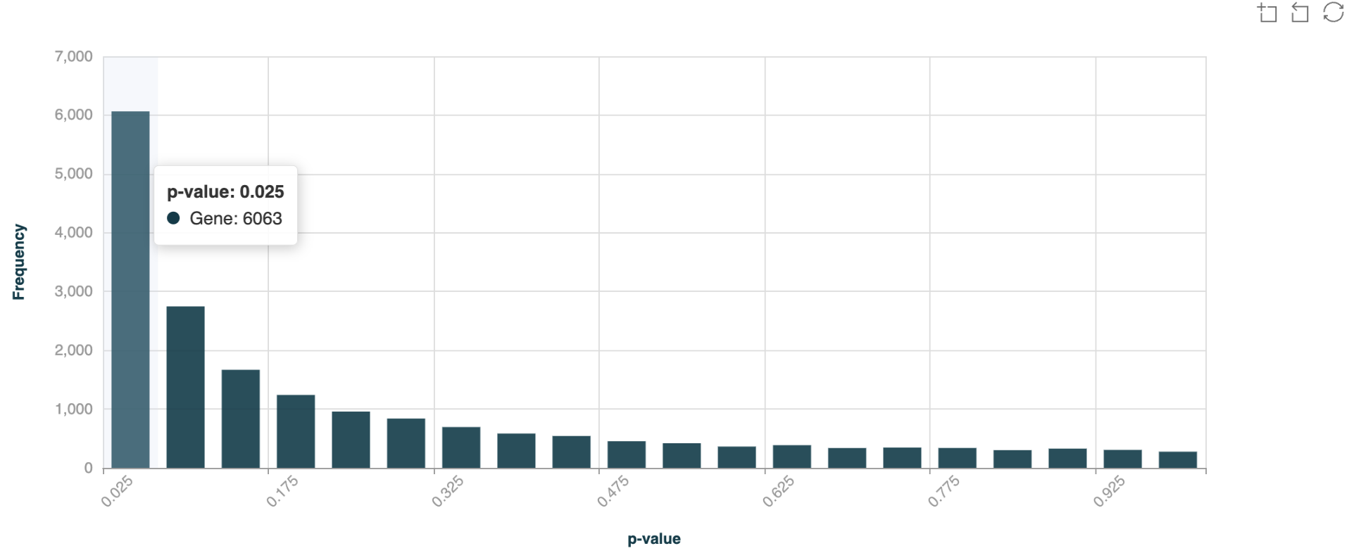
The p-value distribution histogram serves as a quality control metric, showing the distribution of statistical significance across all tested regions - a proper distribution should be relatively flat with a slight peak near zero, indicating genuine differential methylation signals above background noise. Hover your cursor over the bars to view the number of DMRs in each p-value bin.
Below is an example of p-value distribution for 5hmC DMRs (CRC Healthy Control vs Stage IV) over gene bodies, with overdispersion correction turned off.
Now here is an example of p-value distribution for 5hmC DMRs (CRC Healthy Control vs Stage IV) over gene bodies, with overdispersion correction turned on.
DMR Manhattan plot#
The Manhattan plot displays the genomic distribution of differentially methylated regions across chromosomes, helping to identify regions with clustered methylation changes.
A horizontal dashed coral threshold line indicates the current q-value significance threshold.
This line corresponds to the -log10 of the q-value set in the volcano plot controls, providing a visual reference
for which regions exceed the significance cutoff. Points above the line are more statistically significant.
The threshold line updates automatically when you adjust the q-value threshold in the volcano plot controls.
Hover your cursor over the points to view the genomic coordinates and annotation of the DMRs.
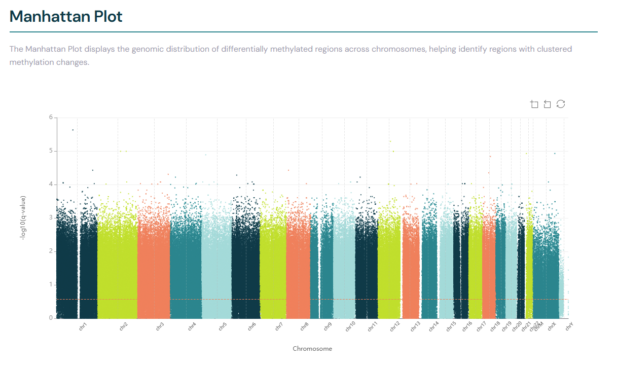
DMR data table#
Below the plots, the detailed DMR report page includes a data table showing the full contents of the DMR BED file. All columns from the source file are shown, including genomic coordinates, statistical metrics (q-value, modification difference, fold change, coverage) and annotation information.
The table is paginated for large result sets. Click a column header to sort by that metric in ascending or descending order. When threshold filters are active on the volcano plot controls, the same filters are applied to the table.
Click any row to copy the genomic coordinates (e.g. chr1:1,000-2,000) to your clipboard.
Where a region overlaps multiple annotations, the values are shown as semicolon-delimited (e.g. promoter;exon;gene), reflecting the raw BED file content.
The same Copy and Export buttons available on the comparison table (see Table features) also appear above the single-file table and behave identically.
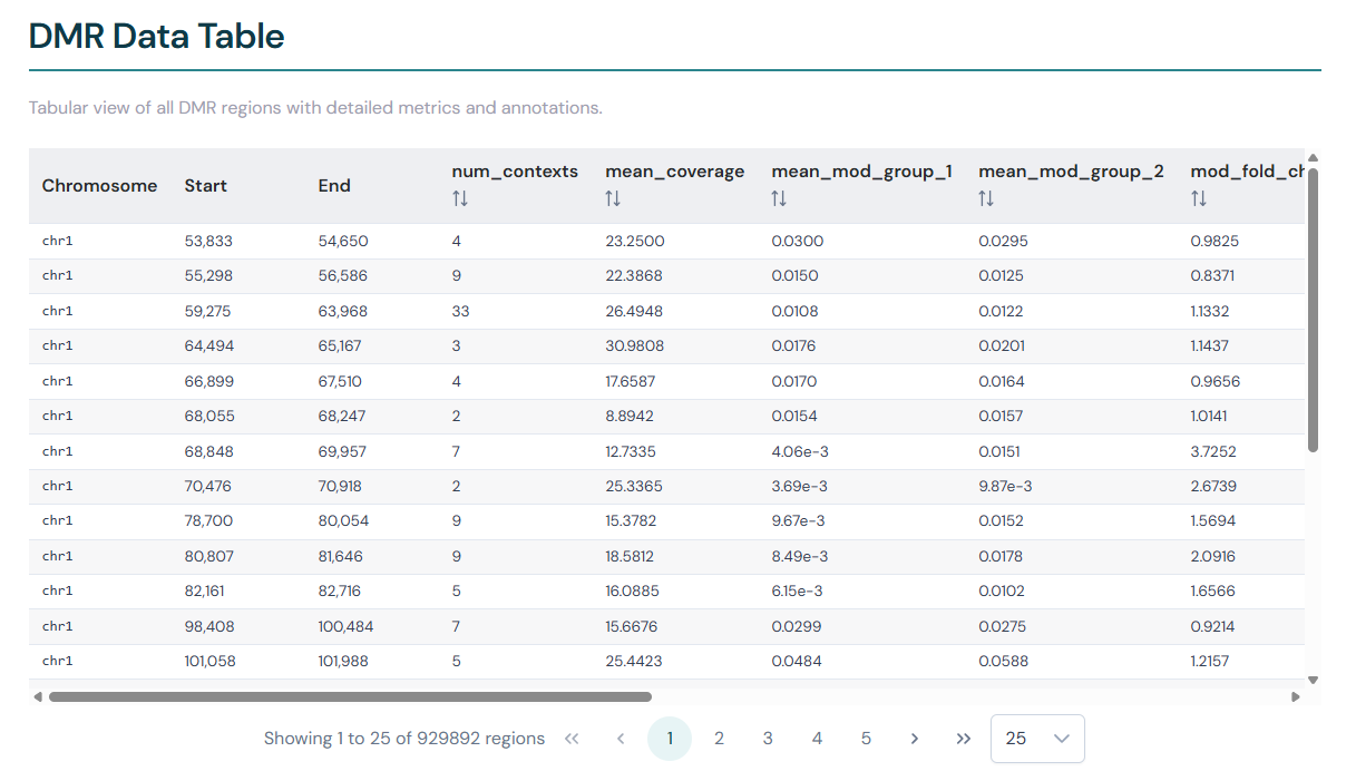
Synchronised filtering between plots and table#
The threshold controls above each volcano plot group (q-value and modification difference) are shared with the comparison table for that context. When you adjust a threshold, the same filter is applied to both the volcano plot and the table: volcano plot datapoints are segmented into significant and non-significant groups, and the table shows only the rows that meet the criteria. Cells that pass the thresholds are highlighted.
Selecting regions for Association heatmap analysis#
The Association heatmaps page accepts a region file of up to 200 regions. A common workflow is to use the DMR comparison page to identify a focused set of the most significant regions, then export exactly those regions for use in a heatmap.
The key distinction to understand before starting:
Copy copies only the rows visible on the current page of the table.
Export writes all rows currently passing the filter to a file — regardless of pagination. If your thresholds still leave thousands of rows passing, Export will write thousands of rows.
The workflow below uses this difference to your advantage.
Set significance thresholds. Use the q-value and modification difference inputs on the volcano plot controls to narrow the result set as far as is biologically meaningful. The row count in the filter bar above the table updates in real time.
Sort by q-value. Click the q-value column header in the comparison table to sort ascending — the most significant regions rise to the top.
Set pagination to 200 rows per page. Use the rows-per-page control at the bottom of the table. This is not about exporting yet — it lets you see the top 200 most significant regions on a single page.
Click Copy. This copies the coordinate columns (Chr, Start, End, Name, Annotation) for those 200 visible rows to your clipboard as tab-separated text.
Paste into the Regions input. Open the Regions panel above the volcano plots, select the Paste tab, paste the clipboard contents, and click Apply. The table immediately filters down to only those 200 rows. You will see the row count confirm: showing 1–200 of 200 regions.
Click Export. Now that the table contains exactly 200 rows, Export will write exactly those 200 rows to a BED file in
analysis_regions/. Provide a filename in the dialog and confirm.Use the exported file as a Region Subset. On the Association Analysis page, select the exported file from the Region Subset dropdown to generate a heatmap over those 200 regions.
Region highlighting#
The Viewer allows you to highlight specific genes or genomic regions on volcano and Manhattan plots, making it easier to locate regions of interest across visualisations.
Supplying regions#
A Regions input panel appears above the volcano plot section on both the detailed DMR report page and the DMR comparison page. Two input methods are available: Paste and Browse.
Paste#
Select the Paste tab (selected by default).
Enter gene names in the text area, one per line (e.g.
ZEB2,TP53,DOK5).Alternatively, enter genomic regions in BED3 format, one per line (e.g.
chr2:1000000-2000000).Click Apply.
You can also paste tab-separated BED3+ data (with a header row containing Chromosome, Start, End, and optionally Name). The parser automatically detects the format.
After applying, a status message shows how many names or regions were loaded. If names are used, a match summary reports how many were found in the current dataset and lists any unmatched names.
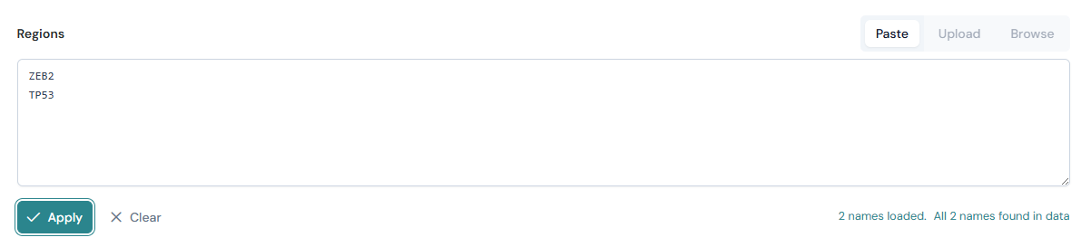
Browse#
The Browse tab allows you to load a region file directly from the analysis_regions/ folder in the Viewer root directory, without copying and pasting its contents.
Select the Browse tab.
Choose a file from the dropdown. Files in
analysis_regions/are listed automatically; the region count is shown next to each filename.Click Apply.
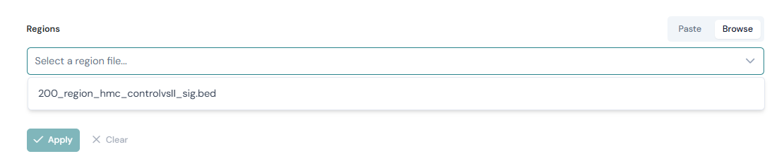
See the Region files (analysis_regions/) section under Association analysis for guidance on placing files in the analysis_regions/ folder.
Click Clear to remove all highlights from either input method.
Highlighting on plots#
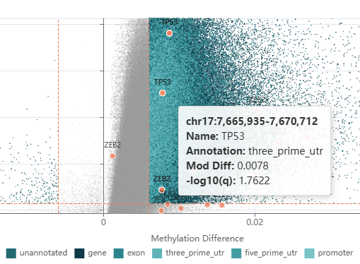
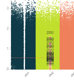
When gene/coordinate filtering has been applied to regions, matched data points are highlighted on both the volcano and Manhattan plots.
Each match appears as a coral-coloured marker (●) with the gene name labelled above it.
Hover over a highlighted point to see the genomic coordinates, gene name, annotation type, modification difference and -log10(q) value.
Click any point — highlighted or otherwise — to copy its genomic coordinates and open a pop-up notification offering to launch the Track Viewer for that region in a new tab.
Regions can be matched in two ways:
By name — the Viewer looks for an exact match against the
Namefield in the DMR data.By coordinate overlap — when you paste BED coordinates or
<chr>:<start>-<end>format regions, any data point whose genomic interval overlaps a supplied region is highlighted.
You can combine both modes in a single query (e.g. some entries matched by name, others by coordinate).
Filtering the DMR table by active regions#
When gene/coordinate filtering has been applied to regions, the DMR comparison table is automatically filtered to show only rows that match the supplied genes or coordinates. This makes it straightforward to focus the table — and any subsequent export — on your specific regions of interest.
The filter applies to both the per-context comparison tables on the DMR comparison page and the data table on the detailed DMR report page. Clearing the regions input (click Clear) removes the filter and restores the full table.
Genome track plots#
The Track Viewer is an interactive genomic browser that displays methylation traces, methylation differences and DMR annotations for a specific DMR analysis. It uses the igv.js genome browser library to render tracks against a reference genome, with data loaded on-the-fly from the backend as you navigate.
The Track Viewer is accessed from within a detailed DMR report. It is not a standalone page — it always operates in the context of a specific DMR file, from which it automatically inherits the analysis configuration (Zarr stores, sample groups, methylation context, and other parameters).
Opening the Track Viewer#
The Track Viewer is reached via a multi-step navigation from the main Viewer:
Open the Viewer and navigate to the DMR Results tab.
A DMR comparison page is shown, which may contain multiple volcano plots and comparison tables — one per methylation context and group comparison.
To open the detailed DMR report for a specific comparison, click the View Full Report button (
) in the top-right corner of the corresponding volcano plot.On the detailed DMR report page, click any data point on the volcano plot or any row in the DMR data table. The genomic coordinates are copied to your clipboard.
A pop-up notification appears in the upper right: View in Track Viewer — Click to explore {region} in the genomic track browser.
Click the pop-up to open the Track Viewer in a new browser tab, pre-navigated to the selected genomic region.
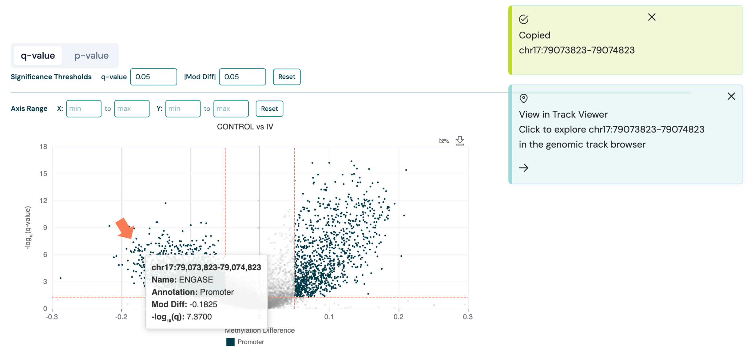
The Track Viewer URL includes the DMR file path and region as query parameters (e.g. /tracks/viewer?path=/data/analysis.bed®ion=chr17:79073823-79074823).
The original DMR report tab remains open, so you can switch back at any time.
Tip
Use the Back to DMR Report link at the top of the Track Viewer page to return to the detailed DMR report for the same file.
Default tracks#
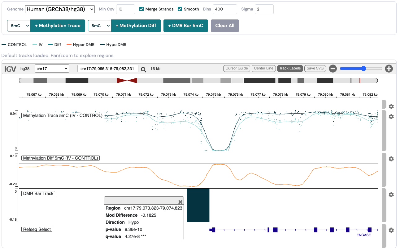
When the Track Viewer opens, it automatically loads three default tracks using the default methylation context from the DMR analysis:
Track |
Description |
|---|---|
Grouped methylation trace |
A line plot showing the mean methylation fraction for each sample group (e.g. Control, Treatment) in the default context. Each group is drawn as a separate coloured line, so you can compare methylation levels across the region. |
Methylation difference trace |
A line plot showing the per-position difference in methylation between the two groups (Group B minus Group A). Values range from −1 to +1; positive values indicate higher methylation in the test group (hypermethylation) and negative values indicate lower methylation (hypomethylation). |
DMR bar track |
A bar chart showing the modification difference for each DMR that overlaps the current view. Bars are coloured by direction: orange for hypermethylated DMRs and dark blue for hypomethylated DMRs. Hover over a bar to see the region coordinates, modification difference, p-value, q-value and significance stars. |
All three tracks are loaded sequentially on the page. If any individual track fails to load (e.g. because the Zarr store is unavailable), the remaining tracks still load and a warning message is shown.
The example below shows the genomic tracks for a 5mC DMR between Control and Stage IV colorectal cancer (CRC) samples, zoomed in on the promoter of the ENGASE gene. The grouped methylation trace shows lower 5mC in the Stage IV group (light teal) relative to the Control group (dark teal), and the difference trace confirms a negative methylation difference across the region. The DMR bar track shows the corresponding hypomethylated DMR as a dark teal bar (hypermethylated DMRs are shown in orange). Gene annotations fetched from the reference genome are also shown in the bottom track, with the ENGASE gene clearly downstream of the DMR in the promoter region.
Track control panel#
Above the genome browser, the track control panel provides settings and actions for managing tracks.
Reference genome#
Use the Genome dropdown to select the reference genome assembly. The available options are:
Genome |
Description |
|---|---|
|
Human (GRCh38) — default |
|
Human (GRCh37) |
|
Mouse (GRCm39) |
|
Mouse (GRCm38) |
Changing the genome will refresh the browser instance. All previously loaded tracks will be removed and will need to be added again.
Data processing options#
The following settings control how the backend processes methylation data before returning it to the browser.
Setting |
Default |
Description |
|---|---|---|
Minimum coverage |
10 |
Positions with total read coverage below this threshold are excluded. Increasing the value filters out low-confidence data points. |
Merge strands |
On |
When enabled, forward and reverse strand methylation counts at each CpG site are combined into a single value. This is recommended for CpG-context analyses. |
Smoothing |
On |
When enabled, a coverage-weighted Gaussian smoothing kernel is applied to the trace before rendering. This reduces per-position noise and reveals broader methylation trends across the region. |
Smoothing bins |
400 |
The number of equally spaced bins used for the Gaussian kernel. A higher value produces a finer grid. Only shown when smoothing is enabled. |
Smoothing sigma |
2.0 |
The standard deviation (in bin units) of the Gaussian kernel. A larger value produces a smoother trace. Only shown when smoothing is enabled. |
Changes to these settings take effect the next time a track is added or the browser is panned or zoomed.
Adding and removing tracks#
The control panel includes buttons to add tracks and a context selector to choose the methylation type:
Methylation context selector — Choose from the available contexts (e.g.
5mC,5hmC,5modC,C). The available contexts depend on which were used in the original DMR analysis.Add Methylation Trace — Load a grouped methylation trace in the selected context. Each sample group is shown as a separate coloured line.
Add Methylation Diff — Load a methylation difference trace (Group B minus Group A) in the selected context.
Add DMR Bar — Load a DMR annotation bar chart for the current DMR file.
Clear All — Remove all methylation and DMR tracks from the browser. The reference sequence and ruler tracks are preserved.
You can add multiple traces for different contexts simultaneously (e.g. a 5mC grouped trace and a 5hmC grouped trace in the same browser view).
Legend#
Below the control panel, a colour legend identifies each track:
Sample groups — Each group name is shown with its assigned colour, cycling through the biomodal colour palette.
Diff — The methylation difference trace is shown in teal.
Hyper DMR — Orange bars in the DMR bar track indicate hypermethylated DMRs.
Hypo DMR — Dark blue bars indicate hypomethylated DMRs.
Warnings#
If any track data request fails, a warning banner appears below the legend listing the errors. Click Dismiss to clear the warnings. Individual track failures do not prevent other tracks from loading.
Browsing and interaction#
The genome browser provides standard igv.js navigation features:
Pan — Click and drag horizontally within the browser to move along the chromosome.
Zoom — Use the scroll wheel or pinch gesture to zoom in and out. The
+and−buttons in theigv.jstoolbar also control zoom.Search — Use the
igv.jssearch box to navigate to a specific locus (e.g.chr1:1000000-1050000), gene name, or other searchable identifier supported by the selected genome.Track re-order — Click and drag tracks using the toolbar on the right-hand side to re-arrange the order of tracks.
Dynamic data loading — When you pan or zoom, the Viewer fetches new data from the backend for the visible region. The methylation traces, difference traces and DMR bars all update automatically.
Track-level settings#
Each track has its own settings menu that can be accessed by clicking on the settings wheel (
 ). These options are enabled by IGV and allow:
Setting track name label
Adjusting y-axis scale and range
Toggling autoscaling
Setting track colours
Removing a track
Tip
The settings menu window can be re-positioned by clicking and dragging, in the event that some of the items are cropped by the browser window.
DMR bar tooltips#
Hovering over a bar in the DMR bar track reveals a tooltip with additional information for that DMR:
Genomic coordinates (chromosome, start, end)
Modification difference value
Direction (Hyper or Hypo)
p-value
q-value with significance stars (
*for q ≤ 0.05,**for q ≤ 0.01,***for q ≤ 0.001)
Performance note
Each pan or zoom triggers a fresh request to the backend. For large regions or heavily smoothed data, there may be a brief loading delay.
Note
The Track Viewer requires that the Zarr stores referenced by the DMR file are accessible from the machine running the Viewer server. If the Zarr paths have moved since the DMR analysis was run, the methylation traces will fail to load and a warning will be shown.
Association analysis#
Navigate to the Association Analysis tab on the main file-list page to access options for generating association heatmaps.
Association heatmaps display methylation levels (or modification differences) across a user-defined set of genomic regions, making it straightforward to spot co-varying regions, compare patterns across multiple modification types, and identify sample subgroups. Two modes are supported: Extract heatmaps show per-sample methylation values; DMR heatmaps show per-comparison modification differences. A filter sidebar on the left and a shared settings panel above the cards allow you to configure what is shown and how the heatmaps are generated.
Region files (analysis_regions/)#
Association heatmaps focus on a user-defined set of genomic regions supplied as files in a dedicated folder inside the Viewer root directory:
<viewer-root>/
└── analysis_regions/
    ├── promoters.bed
    ├── gene_bodies.csv
    └── pathways/
        └── immune_pathways.bed
Place any BED or CSV file here and refresh the Viewer browser window (subdirectories are supported). The Viewer automatically detects these files and lists them in the Region Subset dropdown on the Association Analysis page, showing the region count next to each filename.
File format — files must contain at minimum three BED3 columns identifying each region (Chromosome, Start, End). Additional columns beyond BED3 are treated as region metadata and appear as options in the Region Groups dropdown, allowing rows in the heatmap to be colour-annotated by pathway, gene type, annotation, or any other per-region attribute.
Note
A single region file may contain a maximum of 200 regions. Larger files will be rejected at validation time with an explanatory error message.
Left-hand filters#
Data Type — Show Extract cards, DMR cards, or both.
Datasets / Region Set / Sample Sheet — Multi-select checkboxes to narrow the card list.
Filters are combined with AND logic and applied reactively.
Global heatmap settings#
The settings panel above the cards applies to every heatmap generated from this page.
Setting |
Description |
|---|---|
Region Subset |
Select a BED or CSV region file from |
Region Groups |
Appears when the selected region file contains metadata columns. Choose a column to colour-annotate the rows of every heatmap (e.g. pathway, gene-body annotation). |
Clustering — Regions |
Hierarchical clustering of rows (default: on). Reorders regions by similarity and adds a dendrogram. |
Clustering — Samples / Groups |
Hierarchical clustering of columns (default: on). |
Normalisation — Regions |
Z-score normalisation per region across samples. Mutually exclusive with Samples normalisation. |
Normalisation — Samples / Groups |
Z-score normalisation per sample across regions. |
Extract cards#
Each Extract card represents a group of files that share the same analysis parameters but differ by methylation context (e.g. 5mC, 5hmC). The card header shows the dataset name, region set, operation type (e.g. regional-frac) and any additional parameters.
Per-card controls:
Context checkboxes — Select which modification (e.g. 5mC, 5hmC, modC) to include. At least one must be checked.
Sample Groups dropdown — Choose a sample sheet column to colour-code samples in the heatmap. Only shown when a sample sheet is associated with the card.
Split by modification type — When on (default), one heatmap is generated per selected modification type (e.g. 5mC, 5hmC, modC). When off, all selected modification types are combined into a single multi-column heatmap.
After configuring the card, click Generate Heatmap. The Viewer validates that the selected regions intersect the data before navigating to the heatmap report.
DMR cards#
Each DMR card lists the available group comparisons. Each row in the comparison table represents one modification type within a comparison, along with an overdispersion (OD) selector when both overdispersion-corrected and uncorrected files exist.
Per-card controls:
Comparison checkboxes — Select which group comparisons to include (multi-select).
OD variant — Choose between overdispersion-corrected (
OD=true) and uncorrected (OD=false) files when both are available.Split by modification type — Same behaviour as Extract cards.
A region file must be selected in the global settings before Generate Heatmap is enabled. If the selected regions do not overlap any DMR data, an error is shown on the card.
Generating a heatmap: end-to-end workflow#
The following steps walk through the full process of generating an Association Heatmap from scratch. Details on each control are given in the sections above; this workflow ties them together in order.
Prepare a region file. Create a BED or CSV file with at least
Chromosome,StartandEndcolumns, containing up to 200 regions of interest. Add aNamecolumn and any additional metadata columns (e.g.Pathway,Annotation) if you want to colour-annotate rows in the heatmap. Place the file in<viewer-root>/analysis_regions/before starting the Viewer.Navigate to the Association Analysis tab. Click the Association Analysis tab in the navigation bar. All discovered Extract and DMR datasets appear as cards. Use the left-hand filters if you need to narrow the card list.
Select a Region Subset. In the global settings panel above the cards, open the Region Subset dropdown and choose your region file. The Viewer confirms the region count next to the filename. If your file contains metadata columns beyond BED3, the Region Groups dropdown appears — select a column to apply row-level colour annotation to every heatmap generated during this session.
Adjust clustering and normalisation if needed. Hierarchical clustering is on by default for both rows (regions) and columns (samples or comparisons). Turn off Clustering — Regions if you want to preserve the original order of regions from your file, for example when regions are already ordered by pathway or chromosomal position. Normalisation options are off by default; enable one only if you want to highlight relative patterns rather than absolute methylation levels.
Configure the card.
For an Extract heatmap — check the modification context(s) of interest (e.g. 5mC, 5hmC). If a sample sheet is available, choose a metadata column from the Sample Groups dropdown to colour-code sample columns. Toggle Split by modification type off to combine all selected contexts into a single heatmap.
For a DMR heatmap — check the group comparison(s) to include and select the overdispersion variant. The Generate Heatmap button remains disabled until a region file is selected in step 3.
Click Generate Heatmap. The Viewer validates that the selected regions overlap the data, then navigates to the heatmap report page. If no overlap is found, an error is shown on the card — verify that the genomic coordinates in your region file match the assembly used for the analysis (e.g. hg38 vs hg19).
Explore and refine on the report page. Use the on-page settings bar to adjust clustering, normalisation or region grouping without returning to the landing page; click Apply after each change. Click a heatmap to enlarge it in a lightbox, or use Download image to export a timestamped PNG.
Heatmap report pages#
After clicking Generate Heatmap, the Viewer navigates to the appropriate report page.
Each plot section includes:
A descriptive title identifying the modification type(s) and variable (e.g.
5mC / 5hmC Regional Fraction Association Heatmap).Region and sample (or comparison) counts.
An excluded-regions warning if any BED regions were not present in the data.
Colour legends for modification types, sample groups (Extract only), and region groups (when a region metadata column is selected).
A Download image button to save a timestamped PNG.
Click the heatmap image to enlarge it in a lightbox.
On-page settings#
A settings bar at the top of both report pages lets you adjust clustering, normalisation, and region grouping without returning to the landing page. Click Apply to re-render all plots with the updated settings.
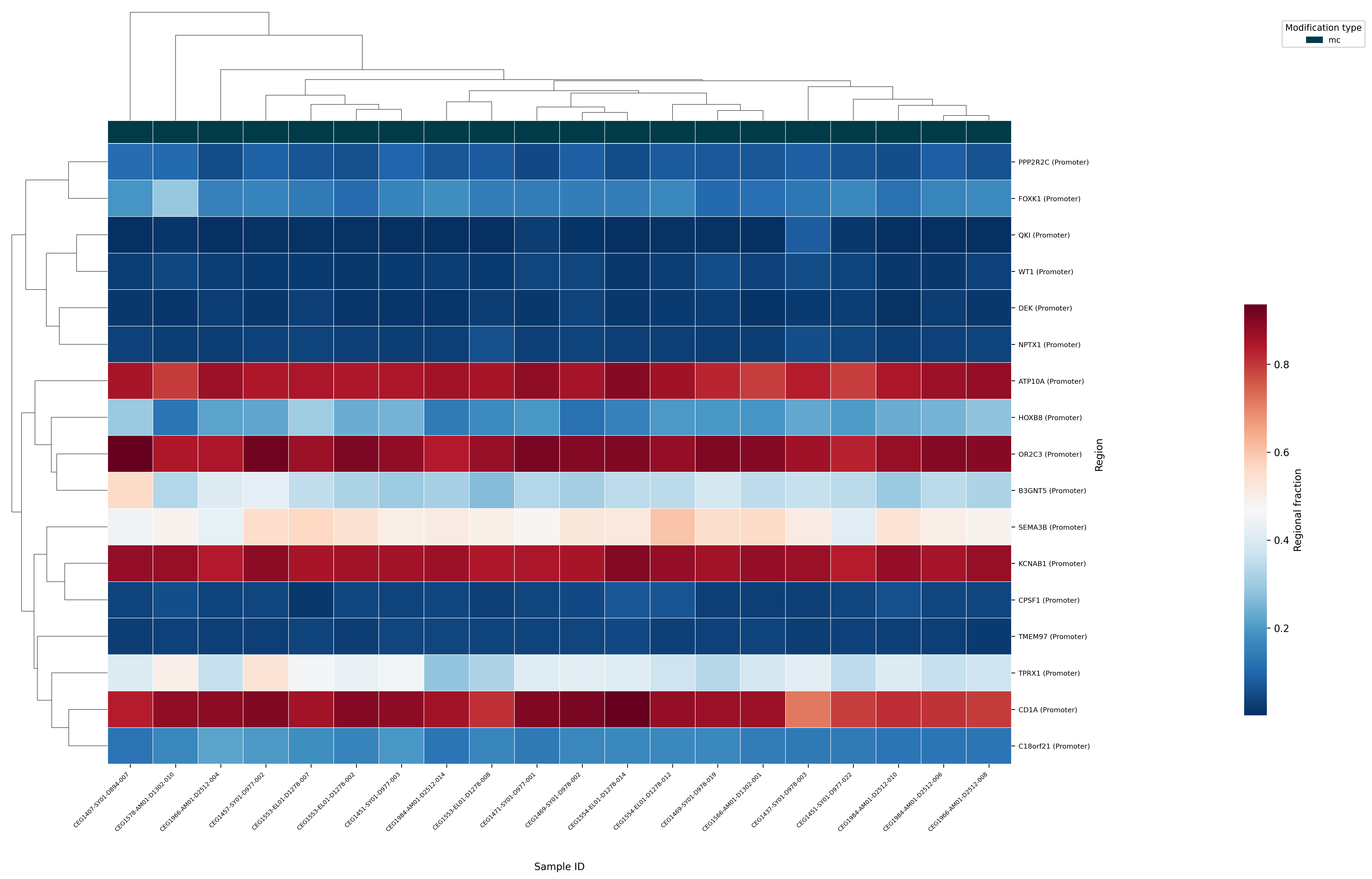
The example below shows an Extract heatmap of mean 5mC methylation at the promoters of genes identified as playing a role in colorectal cancer (CRC). Rows represent individual gene promoters and columns represent samples; the colour scale shows regional 5mC fraction. Hierarchical clustering of both rows and columns can be used to identify groups of co-methylated genes and sample subgroups with similar methylation profiles.